
Improving the user experience using field Custom Controls
Posted on 17th September 2020 at 15:39
In our last blog we showed you how a Custom Control can be used to display an Activity View as a Calendar. In this article we look as adding custom controls to show fields as visuals rather than text fields.
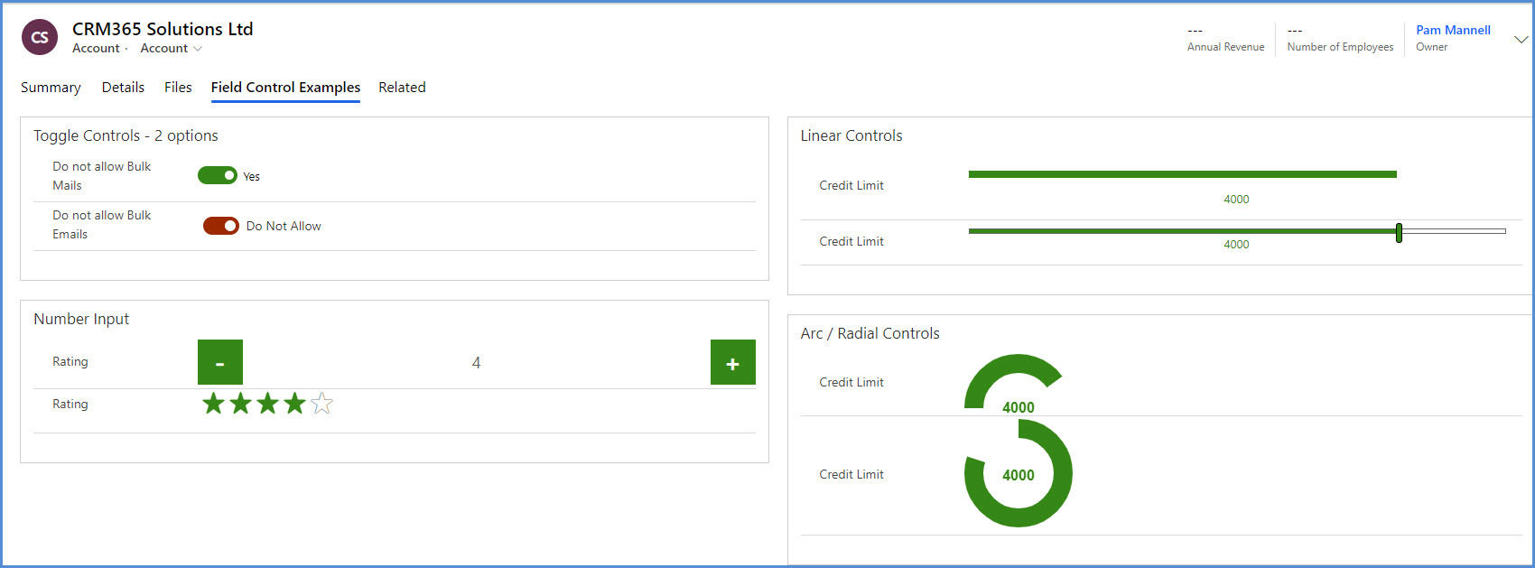
Historically all fields within Dynamics CE have been displayed as simple text fields – regardless of whether they hold data that is text, numeric or currency. To display data in a more visually appealing way you can use Custom Controls on numeric and currency fields, as well as two-option fields.
Custom Controls on a field can be different for different users – for example a web browser may have different controls compared to a CE user on a phone or tablet.
Types of Custom Control
Numeric Fields
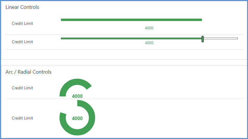
This includes Decimal, Floating Point, Whole Number and Currency fields. There are 4 Custom Controls available within the new UI
• Linear Gauge
• Linear Slider
• Arc Knob
• Radial Knob
In the examples below, the control is always linked to the same field (Credit Limit) for comparison.
As you can see, there are two slightly different variations of each. The linear controls can be used with a mouse and are therefore suitable for all devices, however the arc and radial controls are only suitable for devices with a touch screen and therefore lend themselves far more towards tablet and phone users. Laptops that also work as tablets with a touch screen (for example Microsoft Surface) an also utilise this type of control.
The option shown below for Number Input is also valid for Decimal, Floating Point and Currency fields.
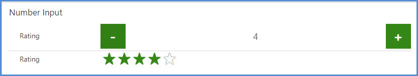
Whole Number Fields
Here you have two choices, a Number Input field which is suited to small numbers where the user might want to increase or decrease by just a couple of numbers (think online shopping!) or for rating information a Star Rating control is often used.
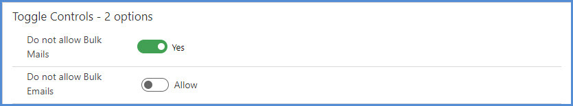
Two Option Fields
The classic two-option field is usually displayed as a simple Yes / No selection but can also be radio buttons or a checkbox. With the new UI there are two options for Toggle visuals.
Adding Custom Controls to Fields
Open your app in App Designer and navigate to the Entity and then Forms where you want to add the control.
Select the relevant Form and edit it.
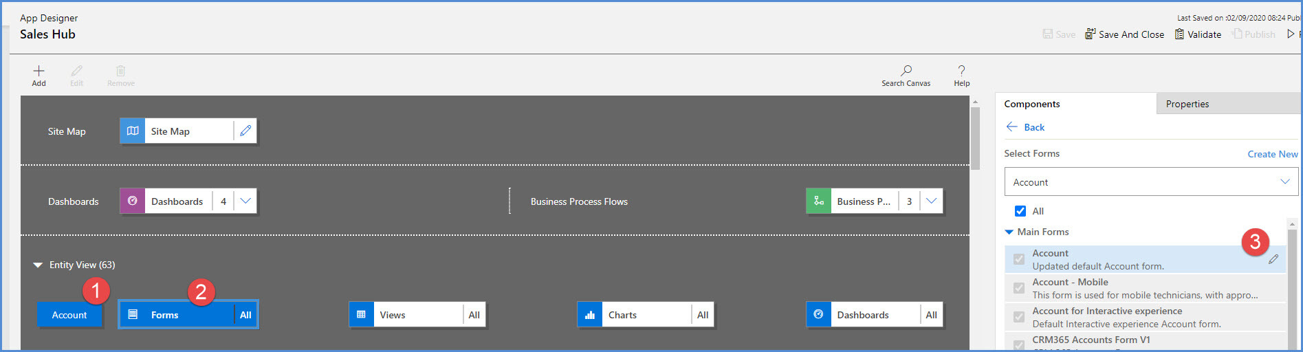
On the form you can either edit an existing field or add a new one.
In either case, once the field is on the form, select it and then in the right hand panel click on Components to add the required control..
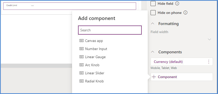
You will then need to configure the control, so in the example of the linear or knob controls you will add in the Min and Max values. Usually these will be entered as Static Values. The Control is then “bound” to a field – in this example Credit Limit.
Scroll down to select where to show the component – Web, Mobile, Tablet.
Remember to Save and Publish your changes afterwards.
Other Controls
Although this article was written to highlight the new visual controls available, it shouldn’t be forgotten that there are a number of other controls that have been available for a while, all designed to improve the user experience – and in many cases data quality as well.
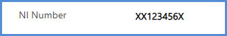
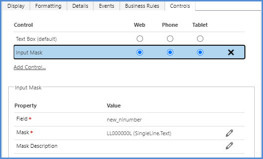
One such example is the Input Mask which allows you to define the format of the data to be entered – for example a National Insurance Number which always follows the same format.
Like the Star Rating, this control can only be added and edited in the classic interface.
In case you missed it – look back at the Calendar Control blog for more ideas on improving the UI for your users.
Tagged as: Customer Engagement, Customisation
Share this post: